Redesigning TalkTalk’s broadband package discovery
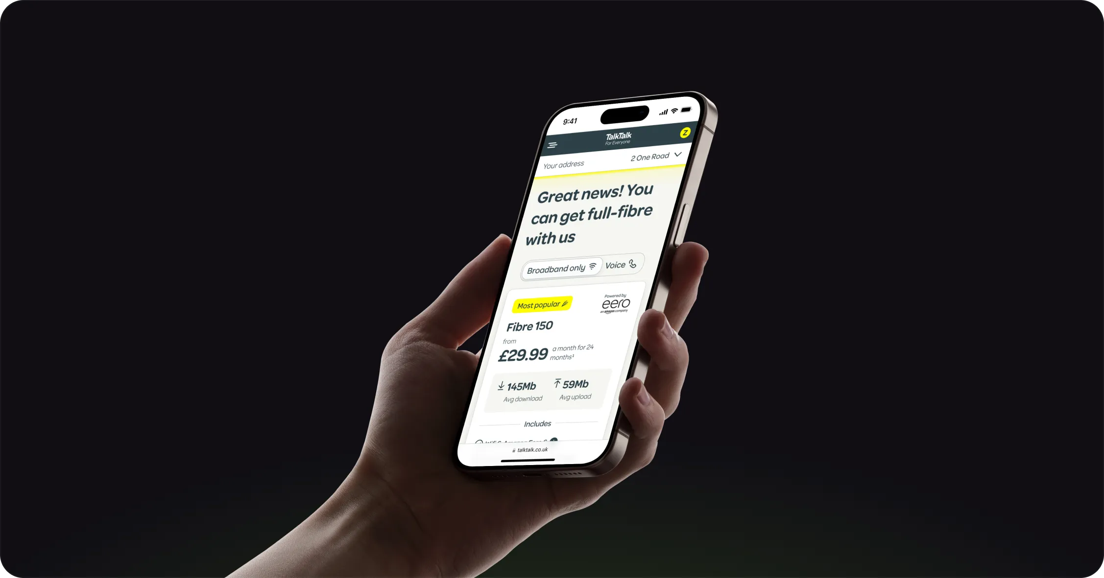
TL;DR
The challenge
Packages were hidden in a carousel and a comparison table over three screens long, so customers rarely looked past the cheapest one.
What I did
Owned the redesign end to end: analytics, card sorting, a card-based layout with progressive disclosure, usability testing and a live A/B test.
The outcome
A reported 7.2% overall conversion uplift in the live A/B test, with mobile conversion up by almost 10%.
Methods used
- Card sorting
- Usability testing
- Information architecture
- Optimisation
- Analytics review
- A/B testing
TalkTalk’s broadband product cards weren’t performing as expected. Customers were struggling to discover and compare the full range of packages, and the existing experience made it hard to explore anything beyond the cheapest one.
Investigating the journey’s performance metrics, I found customers weren’t scrolling through to the ‘View all options’ section. As a result, the cheapest package was disproportionately favoured, limiting exposure to the wider product range.
As Senior UI Designer, I led an end-to-end redesign of package discovery, from problem discovery and concept development through customer research, usability testing, A/B testing and developer handover.
How might we improve CTR while condensing the information and keeping every package easy to reach?
01 The challenge
The existing experience presented two significant usability challenges:
- Limited package discoverability: packages were hidden within a carousel, so customers couldn’t easily see the full range side by side.
- Complex package comparison: the comparison table extended beyond three viewport heights, requiring considerable scrolling and making it hard to understand the differences between packages.
Performance metrics also showed customers weren’t engaging with the ‘View all options’ section. Most attention was concentrated on the cheapest package, restricting customers’ ability to discover alternatives that might better meet their needs.
02 Defining the design direction
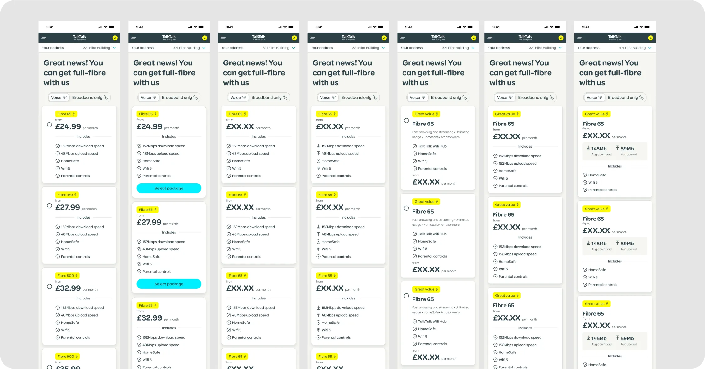
I explored alternative ways of presenting the packages, moving away from the carousel and lengthy comparison table towards a more accessible card-based experience.
The intention was a clearer information hierarchy, letting customers understand the key differences between packages without being overwhelmed by information.
Customer-led information architecture
Before defining the final card structure, I ran a customer card-sorting exercise to understand how people naturally group and prioritise broadband package information. It highlighted differences between customers’ preferred hierarchy and TalkTalk’s original presentation.
I used these findings to set the prominence of each piece of information, establishing what customers needed to see immediately and what could be progressively disclosed.
03 Designing the experience
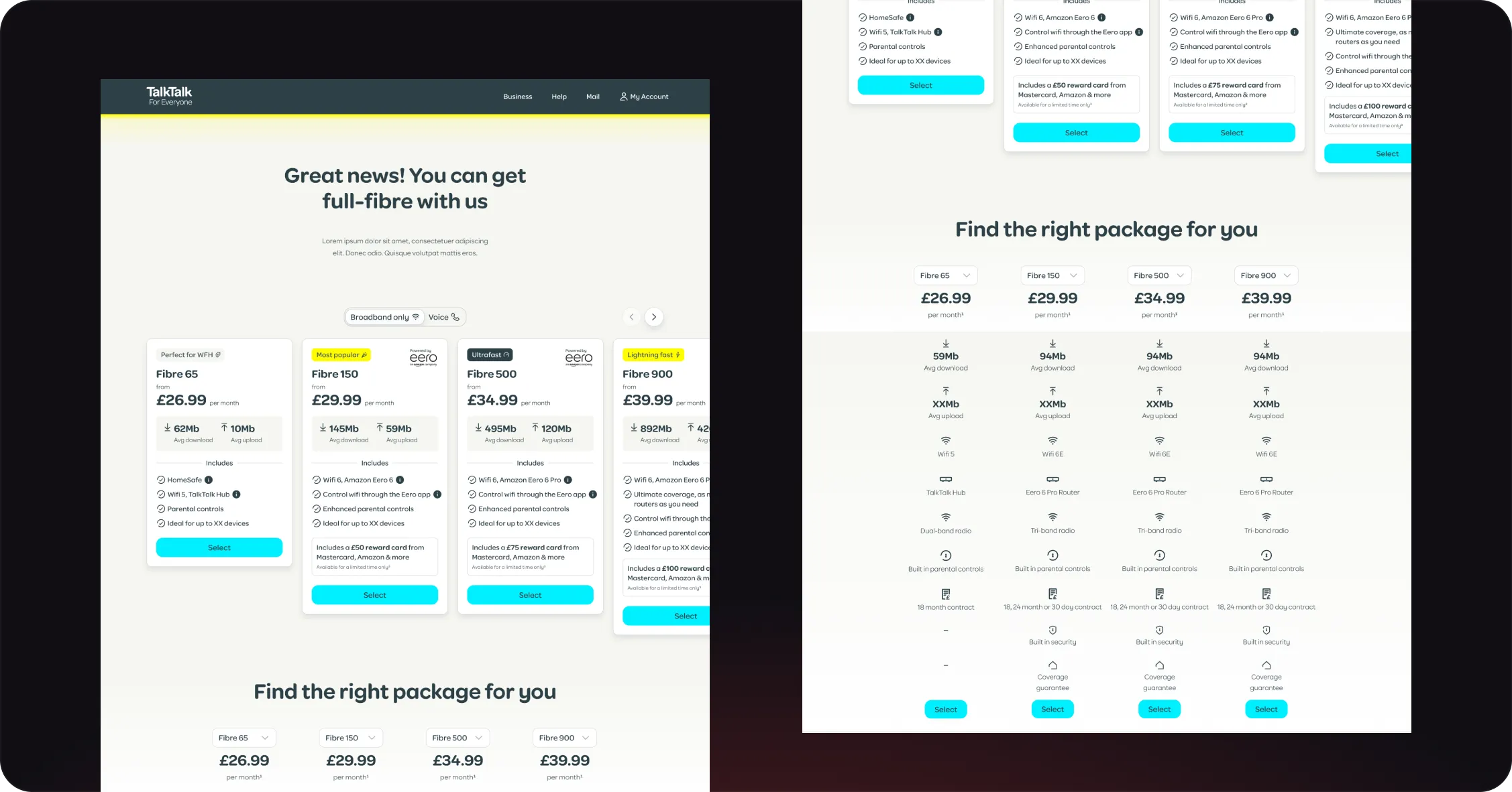
I developed a card-based layout around three levels of information:
- At-a-glance package summary: each card presented the essentials needed to assess a package: its name, monthly price, average download and upload speeds, a popularity indicator and key benefits.
- Progressive disclosure: rather than presenting every detail upfront, customers could expand a card for more package information, keeping the first view concise while retaining access to detailed specifications.
- Contextual feature explanations: information icons let customers explore individual features in more detail, at the point they were needed, without adding content to the main card.
This balanced information density with transparency, giving customers a quicker way to compare packages while keeping the detail needed to make an informed decision.
04 Usability validation
I ran an unmoderated usability study with 10 customers to evaluate the proposed experience. Participants preferred the card-based layout, valuing the straightforward way of comparing packages while keeping the option of a more detailed table-based comparison.
The findings supported the direction of the card design. A comparison table was considered as a supplementary feature for a later iteration, although it wasn’t included in the live A/B test.
05 A/B testing and results
Following usability validation, the redesigned cards were taken into a live A/B test against the original experience. The results demonstrated the commercial value of making the wider package range easier to discover and simplifying how customers explored their options.
The comparison table was intended for a subsequent iteration, but I left TalkTalk before that work progressed.
Core metric
7.2%
Overall conversion uplift¹
¹reported result of the live A/B test
~10%
Mobile conversion uplift²
²almost 10%, reported in the same test
06 My contribution and impact
I owned the design process end to end:
- Investigating journey performance metrics to identify the underlying discoverability problem.
- Defining the design challenge and exploring alternative package presentation concepts.
- Running customer card sorting to inform the information architecture.
- Designing and refining the card layout, including progressive disclosure and contextual feature explanations.
- Conducting unmoderated usability testing with 10 customers.
- Supporting the live A/B test and working closely with developers through handover.
The redesign addressed a fundamental issue in the broadband acquisition journey: customers couldn’t easily discover or compare the full range of packages. By restructuring the information hierarchy and introducing a more accessible card-based experience, we made package discovery simpler while presenting less information upfront.